5 Ways How a Web Designer Can Help You with a High Bounce Rate
5 minutes | Word Count: 870A bounce rate is a number telling you what percentage of your visitors navigates away from your page after only seeing the landing page. The reason behind it is that most likely they do not find your page to be relevant to their search.
Google is the one who told them to come and visit you and since they will never allow themselves to lose their credibility, your bounce rate is one of the things they will take into consideration when ranking you. Here is how a good web design can help you maintain the good rate.
Prevent the following
There are several actions a visitor to your page may do and which count as bouncing away. First of all, they may find something useful on your page, a link they find interesting and if that link is leading to a page on a different website, even though it may be your sub-domain, it is seen as if though they bounced away from your page. Only clicks leading to pages on your website count as success. Furthermore, there are more obvious actions they can take such as closing the window, clicking to go back to the search result list, typing a new URL into the address bar or a session timeout.
Consistency
Your website needs to be consistent with your visitor’s expectations, that is, with the way you represent your website. If you place an ad somewhere make sure that it is relevant to your services and the actual content of your landing page. Otherwise, they will see it as false advertising and a waste of their time. Also, adjust the keywords in your website’s Meta description, again, to be relevant to the page you are landing them on. Using unrelated keywords to attract traffic is considered to be black SEO and you can get penalized by Google for it.
Have the right flow
Your landing page needs to be interesting enough to keep them on the page, but also, you want them to navigate through your website and get to your other pages. The number of service providers and the chance to see them all online is the reason I think an average Internet user is quite lazy. They have everything laid out for them so they are not going to bother too much to find the content they need once they visit your website. You need to make the content flow and lead them from page to page not even by clicking, but by scrolling if possible. The content needs to have a clear and logical layout so to make it an easy and enjoyable experience for your visitors.
SEO
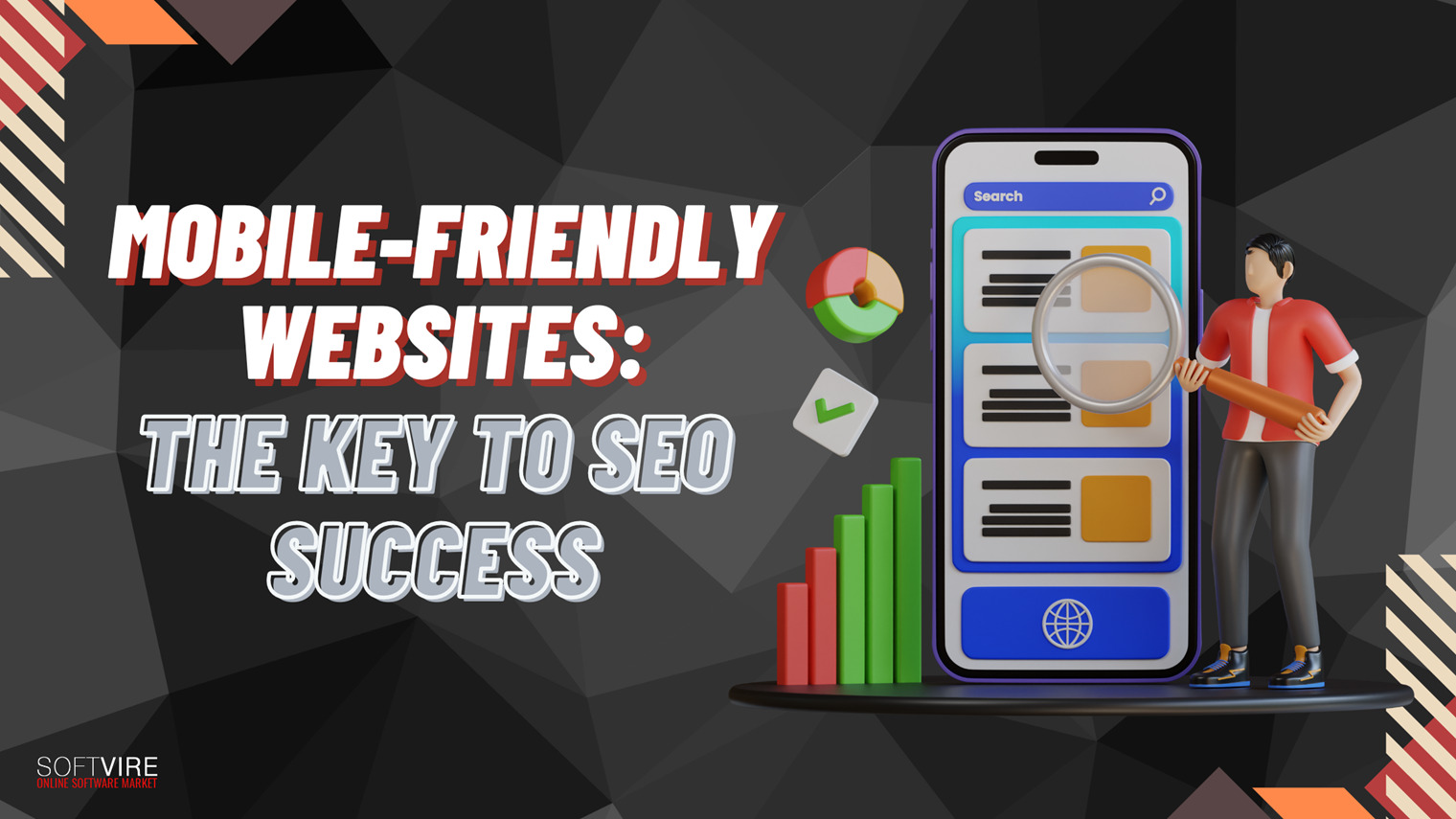
Search engine optimization is a thing to bear in mind when designing a website. A good layout is worthless if it is hard to get to the site so the background of the website should be as important as its face. One of the important things for SEO which can also reduce the bounce rate is the website’s responsiveness. You need it to load quickly. People will probably wait up to 10 seconds for a page to load and if it fails to do so, they will navigate away and that goes straight to your bounce rate. A website should be at least mobile responsive if not mobile optimized as there is an increasing number of people using their mobile devices to browse the web. If they have trouble seeing your content on their device, they won’t bother with it.
Easy Search
If you do not know how to get somewhere, ask someone. Perhaps a visitor to your web page believes you are the right service provider but they cannot get to the right place or they want to do it faster. A logical thing for them would be to search your website for the info. However, some websites tend to make their search fields tiny and impossible to find, this is something you should avoid. A search box should be big and at the top of the page so no one can miss it. Another very annoying thing when it comes to search options is when it searches the entire web instead of the website, please avoid this.
Be creative and inviting
A creative web design experts knows how to use colors and images to attract people’s attention. They should know where to place ads so they are clearly visible but not in your visitor’s way when trying to search for something. Your page should have clear and simple call-to-action buttons and it should offer educational and promotional multimedia. If you use multimedia, make sure that there is no auto play, as even background music that switches on by itself can be annoying and a reason to instantly navigate away.
As with many other technical issues, unless you are from the same niche, the wisest idea is to hire professionals to help you take care of an issue or avoid it in the first place. A web designer should know what to keep an eye on so this is yet another reason to stay away from a template design and get yourself a custom one, it will prove to be worth it.


