An extensive guide on designing a Mobile Responsive website
7 minutes | Word Count: 1379The ever-evolving era of smartphones and smart tablets has lead to a rapid growth in the number of website owners who’re looking forward to make their sites mobile responsive. Well, when a website is responsive, it basically has a layout and/or content that adapts well to the size and resolution of the screen that is being used for viewing the site. So, if you’re a developer and want to indulge in the creation of a remarkable responsive website, this is a post that will serve as your handy guide.
A quick look at the pre-requisites
Well, talking about the knowledge that’s required for building a responsive website, you need to have a clear understanding of basic HTML and CSS. Plus, you also require a suitable text editor along with 1-2 hours that would be consumed in executing the website development project.
And now to the steps associated with creation of a mobile responsive website
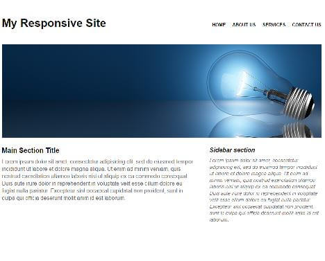
In this tutorial, you’ll get to know about the process of creating a fluid page that comprises of a feature image, navigation and a two-column layout. Have a look at the below HTML Structure:
<!DOCTYPE html>
<html lang=”en”>
<head>
<meta charset=”utf-8″/>
<title> Demo | Responsive Web</title>
<meta name=”viewport” content=”width=device-width, minimum-scale=1.0, maximum-scale=1.0″ />
<link href=”style.css” type=”text/css” rel=”stylesheet”>
<!–[if lt IE 9]>
<script src=”//html5shiv.googlecode.com/svn/trunk/html5.js”></script>
<![endif]–>
<script type=’text/javascript’ src=’respond.min.js’></script>
</head>
<body>
<div id=”col-wrap”>
<header>
<nav id=”col-skip”>
<ul>
<li>
<a href=”#main” title=”Skip to Main Content”>Skip to Main Content</a>
</li>
</ul>
</nav>
<h1>My Responsive Site</h1>
<nav>
<ul>
<li><a href=”#” title=”Home”>Home</a></li>
<li><a href=”#” title=”About Us”>About Us</a></li>
<li><a href=”#” title=”Services”>Services</a></li>
<li><a href=”#” title=”Contact us”>Contact us</a></li>
</ul>
</nav>
<div id=”banner”>
<img src=”banner.jpg” alt=”banner” />
</div>
</header>
<section id=”main”>
<h1>Main Section Title</h1>
<p>Lorem ipsum dolor sit amet, consectetur adipisicing elit, sed do eiusmod tempor incididunt ut labore et dolore magna aliqua. Ut enim ad minim veniam, quis nostrud exercitation ullamco laboris nisi ut aliquip ex ea commodo consequat. Duis aute irure dolor in reprehenderit in voluptate velit esse cillum dolore eu fugiat nulla pariatur. Excepteur sint occaecat cupidatat non proident, sunt in culpa qui officia deserunt mollit anim id est laborum.</p>
</section>
<aside>
<h1>Sidebar section</h1>
<p>Lorem ipsum dolor sit amet, consectetur adipisicing elit, sed do eiusmod tempor incididunt ut labore et dolore magna aliqua. Ut enim ad minim veniam, quis nostrud exercitation ullamco laboris nisi ut aliquip ex ea commodo consequat. Duis aute irure dolor in reprehenderit in voluptate velit esse cillum dolore eu fugiat nulla pariatur. Excepteur sint occaecat cupidatat non proident, sunt in culpa qui officia deserunt mollit anim id est laborum.</p>
</aside>
</div>
</body>
</html>
In the above HTML, you’ll notice respond.min.js- a lightweight polyfill that allows media queries to work in Internet Explorer 6 to 8 versions.
Next, have a look at the CSS wherein I’ve set the value for max-width as 100%. Doing this would refrain the webpage from shrinking. Plus, this minor tweak in your CSS will also eliminate the issue associated with switching from fixed width to fluid.
/* Reset
———————————————————— */
* { margin: 0; padding: 0; }
html { overflow-y: scroll;}
body { background:#ffffff; font-size: 13px; color: #666666; font-family: Arial, helvetica, sans-serif;}
ol, ul { list-style: none; margin: 0;}
ul li { margin: 0; padding: 0;}
h1 { margin-bottom: 10px; color: #111111;}
a, img { outline: none; border:none; color: #000; font-weight: bold; text-transform: uppercase;}
p { margin: 0 0 10px; line-height: 1.4em; font-size: 1.2em;}
img { display: block; margin-bottom: 10px;}
aside { font-style: italic; font-size: 0.9em;}
article, aside, details, figcaption, figure,
footer, header, hgroup, menu, nav, section {display: block; }
/* Structure */
/* Reset
———————————————————— */
* { margin: 0; padding: 0; }
html { overflow-y: scroll;}
body { background:#ffffff; font-size: 13px; color: #666666; font-family: Arial, helvetica, sans-serif;}
ol, ul { list-style: none; margin: 0;}
ul li { margin: 0; padding: 0;}
h1 { margin-bottom: 10px; color: #111111;}
a, img { outline: none; border:none; color: #000; font-weight: bold; text-transform: uppercase;}
p { margin: 0 0 10px; line-height: 1.4em; font-size: 1.2em;}
img { display: block; margin-bottom: 10px;}
aside { font-style: italic; font-size: 0.9em;}
article, aside, details, figcaption, figure,
footer, header, hgroup, menu, nav, section {display: block; }
#col-wrap {width: 96%;max-width: 920px;margin: auto;padding: 2%;}
#main {width: 60%;margin-right: 5%;float: left;}
aside {width: 35%;float: right;}
header h1 {height: 70px; float: left; display: block; padding-top: 24px; font-size: 32px;}
header nav { float: right; margin-top: 40px; }
header nav li {display: inline; margin-left: 15px;}
#col-skip { display: none;}
#col-skip li {background: #b1fffc;}
#banner {float: left;margin-bottom: 15px;width: 100%;}
#banner img {width: 100%;}
/* Media Queries */
@media screen and (max-width: 480px) {
#col-skip { display: block;}
header h1 {margin: 0 auto; float: none; text-align: center;}
header nav, #main, aside {float: left;clear: left;margin: 0 0 10px;width: 100%;}
header nav li {margin: 0;background: #efefef;display: block;margin-bottom: 3px;}
header nav a {display: block; padding: 10px;text-align: center;}
}
With the above alteration made to the CSS, your image would display at its parent element’s full width and even contract with the same. Here, one thing that you need to keep in mind is that the image’s max-width shouldn’t exceed the max-width of the image container or else the image would pop outside its container.
Since loading large images can easily affect the mobile responsive website’s load time, you must go ahead with following a responsive image method that would enable you to detect the users’ screen size, followed by pulling in smaller/larger image on the basis of necessary viewports.
Switching the navigation for your mobile responsive website
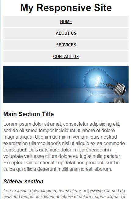
The unreadable and hard-to-click nature of the default navigation system has prompted the designers to switch the navigation to one that can work flawlessly on a variety of mobile devices. Have a look at the code associated with this step:
/* Structure */
#wrapper {
width: 96%;
max-width: 920px;
margin: auto;
padding: 2%;
}
#main {
width: 60%;
margin-right: 5%;
float: left;
}
/* Media Queries */
@media screen and (max-width: 480px) {
#skipTo {
display: block;
}
header nav, #main, aside {
float: left;
clear: left;
margin: 0 0 10px;
width: 100%;
}
header nav li {
margin: 0;
background: #efefef;
display: block;
margin-bottom: 3px;
}
header nav a {
display: block;
padding: 10px;
text-align: center;
}
}
The above code snippet will allow the user to access the navigation more easily. You ca also witness some alterations that have been made to #main and aside section so as to switch them to a single column.
For some mobile devices, you’ll notice that the responsive website would automatically shrink itself so as to fit the screen. It is under such a situation that having a zoom functionality for navigating across the website content serves as the best decision. This is the line of code that your website’s CSS contains in order to allow the media queries to take full effect:
<meta name=”viewport” content=”width=device-width, minimum-scale=1.0, maximum-scale=1.0″ />
Here, the width property will control the viewport’s size. The value for this can be conveniently set to a certain number of pixels, for example width=940. While the initial-scale property will control the level of zooming in the webpage; properties like maximum-scale, minimum-scale and user-scalable properties would be controlling the way users are permitted to zoom in or zoom out a particular webpage.
That’s it for now!
Conclusion
Mobile responsive design is indeed the future of web and hence owning a fully responsive mobile-friendly website will undoubtedly sky-rocket your online venture and you can take help from any Mobile and Web Application Development Company. Here’s hoping the above post would have offered you helpful insights on creating one for enjoying a unique web and mobile presence.

