As a matter of fact, people are absolutely ‘not’ done & dusted with websites for the simple reason that websites are much more informative, comprehendible, and elaborative in nature, and we will have to wait for at least a few decades before we find a substitute. Although mobile app development has had a significant show in the past few years, website designing is still considered the most decent way of tabling your value proposition.
Considering you reading this piece of write-up, you are a writer or an entrepreneur who maybe had to choose between reaching out to website and app developers. And let me tell you, your decision to build a website is wise.
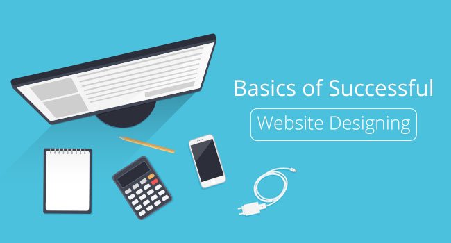
Now that you are into it, you need some of the concepts of website designing that will directly affect the mass reach, and hence, the popularity of your website. Needless to mention, building a website meticulously with utmost attention to user experience (UX) is vital for your business to succeed.
To help you closely understand how UX plays an important part, we are going to discuss some of the elementary concepts of website designing, upon which you can build your legacy. Here is what you need to know:
1.) Build from scratch
Although there are many websites out there that allow you to build your own website with simply drag-n-drop tools, it is not advisable to go for such tools as a website is all about how unique you can be in expressing your vision and message.
Simple website building tools offer templates that some other website as well might be using. Build your website from scratch; outline a design, choose a layout, determine the background images or watermarks you want to use, and get on with it. And even though mobile app development companies have made it easier to check out a business through mobile apps, building a mobile-friendly website would always bring more traffic to your website. So, add ‘mobile-friendliness’ as well to your checklist.
2.) Simplistic designing
Gone are the days when you could stuff your home page with advertisements and affiliate links. Doing that, would not only ruin the flavour of a minimalistic design approach which is clutter-free and basically a visual treat, it would also bring down your SEO rankings if you don’t do something about.
On the contrary, focus on inculcating a simplistic and subtle taste on the home page itself. That said, keeping your home page empty expecting people to follow other links would be suicide in itself. The optimum way of your website designing is to not stuff everything in the topmost section, and rather build a moderately lengthy, scrollable page with all the necessary pieces of information that define your business or your mission at a glance.
Talking about rest of the pages there shall be a sense of uniformity among different components, such as texts, headers, sub-headings, indentations, infographics etc.
3.) Text
While SEO is an indistinguishable part of a website, readability falls under the design segment, which basically deals with how feasible your design is in terms of projecting your content in a more noticeable way. After all, the first and only thing a customer or reader consciously notice is the content. When it comes to font size, avoid block letter that are too big.
A person with an advertent mind for design would know that block letters that are too big are hard to read and often have to be broken with hyphens, which adds even more to discomforting the reader. Another thing to be taken care of is that you should use many font sizes and types throughout the website.
Usually, websites that are considered decent in terms of design maintain uniformity by using equal to or less than three font types and sizes. The number is three because in general, there are three components of content: headings, sub-headings, and the body text. More than three types of text layouts would create confusion for the reader by breaking this synchrony. Yet another basic rule of increasing readability is by creating contrast between text and background.
Contrast is always good for anything that needs to be noticed, and same goes for readability. A light blue text placed with a background of darker blue, or putting dark blue text in the front of a black background, would so not be feasible for your text. On the other hand, black background with white text would create an excellent contrast between the words, and also make the design all the more appealing.
4.) Image quality
You were not planning to not include images and infographics in your website, weren’t you? Thought so!
The images you place on your website must always connect to the theme to contribute to the uniformity. Also, try to stick to only a few types of image to be used on the website. For example – if you use vector art or PNG, try to base the rest of the image throughout the website on the one you choose. In case of image quality as well, contrast is important and the rules for image contrast are the same as those for the text.
Wrapping Up
Although there are many more technical components of a website as well, a neat and well done design layout is the catchiest thing a website could have, which is quite important because on the internet, it is a matter of glances.
However, assuming the website was created for monetary reasons, the technical components such as coding, scripts etc. also play a major role in reaching the desired goal. So, at the end, it is the perfect amalgamation of the design and technical components of a website that is required for a website to become successful.