5 Popular WordPress Mistakes That You Need To Stop Making
5 minutes | Word Count: 840Launching a WordPress website seems like such an easy thing to do. However, though it doesn’t take a lot of time and effort to create a website on WordPress, simply doing so is definitely not enough to make it look appropriate.
There are so many things you need to keep in mind in order to make your WordPress website as polished and impressive as it needs to be. You might still be a beginner, but don’t worry – we’ll help you with that by pointing out the most popular WordPress mistakes you need to avoid.
Mistake 1: Ignoring the backups
Sure, WordPress is a secure platform, but this alone isn’t enough to protect your WordPress website from a malware attack, a sudden crash, a hack, and so on. Unless you think that your website content isn’t valuable, you should always create backups using BackUpWordPress or any other similar plugin. This could also help you in case something goes wrong when you make the changes to the website.
But it’s not only the data that needs to be backed up – you should do the same with the design as well if you consider it important. Backing up a design file is even easier: just find a file called stylesheet.css or styles.css in your wp-content/themes/themename folder and save it to your computer manually.
Mistake 2: Not using permalinks
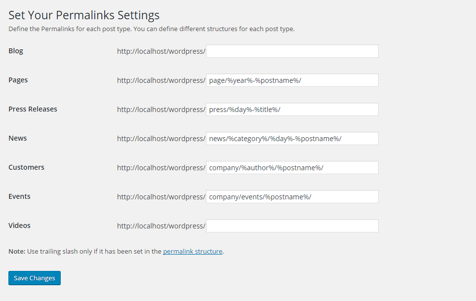
There are three important reasons why you should use permalinks instead of usual WordPress links that look like /?p=67. First, properly chosen permalinks with keywords in them are great for SEO. Second, they look better than classic WP links and are better for social media sharing. Third, it becomes easier for you to organize or edit your content if you use permalinks.
For example, while you might not remember the actual number of your post about essay writing, you’ll probably remember that a permalink for it looks like /best-essay-writing-services.
Mistake 3: Messing up with categories and tags
If you don’t know how many categories and tags you should create, remember that it’s always better to make fewer categories and more tags (assuming these tags don’t repeat each other).
However, many beginner WordPress users do the opposite, creating too many different categories but using fewer tags to navigate within them. This makes the website cluttered and your audience starts struggling with finding the information they need.
Keep in mind that categories should be created for bigger topics, while tags can and should be more specific. For example, if you’re running a design website, your categories might be named «Graphic Design», «Website Design», etc. The tags, in this case, could say «packaging design», «logo design», and so on.
Mistake 4: Leaving incomplete pages
When your website is just created, it might seem tempting to launch it and start promoting it right away, before you even finish figuring all the details out. However, incomplete pages are one of the things that turn the audience off. There aren’t many things that are as frustrating as clicking on some promising-looking link and seeing only «in progress» written there.
What should you do in this case? Well, there are only two options – either refrain from launching your website until you have all the pages filled and all the plugins installed or simply don’t leave incomplete pages there. You can always add all the necessary information later.
Mistake 5: Choosing an inappropriate design
There are some basic design requirements you’ve probably already heard of: pick simple designs, make sure that they are easy to view and read, try not to overdo with visual effects and ads, etc. But there’s another, a bit more complicated thing you need to keep in mind: your website design always needs to reflect your business and the impression you’re trying to create.
For example, picking a plain black and white design with no (or almost no) images for a photography website is a great idea. This way nothing will distract the audience from the photos – and the texts will be easy to read as well (if you do plan on posting any). The same goes for serious and businesslike websites – the design needs to be simple yet look good at the same time.
However, if you’re running a children-oriented website, adding more colors to it would be a great idea. Colors would also suit design websites, creative websites, and so on.
Of course, these examples are very general. You could use bright colors for serious websites as well if you do believe they help make the right impression because in some cases they actually do. For example, the essaywritersite.com doesn’t look frivolous simply because it’s bright – it only shows that it’s student-oriented.
It might take some time before you master all the secrets and tips of handling a WordPress website. But it’s okay – as long as you are willing to learn and implement these tips in life, you’ll be able to make a popular website.

