Designing For Successful Android Tablets (Part 3)
6 minutes | Word Count: 1049Much more than ever, designers are asked today to create experiences for a variety of different mobile devices. With tablet adoption increasing and we move into the post-PC world, companies are now competing for user attention with the quality of their experience. Designing successful apps for Android tablets requires a great concept that encourages downloads, additional usage and retention. But it also requires that Android users enjoy an experience that is intuitive and native to the environment.
The following will help designers become more familiar with Android tablet app design by explaining some of the differences between the iPad iOS user interface and Android’s 3.x “Honeycomb” UI conventions.
OVERFLOW MENU
The overflow menu is a part of the Common Actions group and sometimes is separated by a vertical rule. It’s a place for miscellaneous menu items, such as Settings, Help and Feedback.
SEARCH
Search is also a part of the Common Actions group. The Expand and Collapse action group is unique. Just tap on the search icon and a search box expands out, allowing you enter a query. Tap the “x” to cancel, and it will collapse into its single-button state. This is a great space saver when many actions or tabs need to be shown.
CONTEXTUAL ACTIONS
Contextual Actions change the format of the action bar when an item is selected, to reveal options that are unique to that item. For example, if in a photo app you want to display thumbnails, then the action bar might change as soon as you select an image, providing contextual actions for editing that particular image.
To exit the contextual action bar, users can simply tap either “Cancel” or “Done” at the far right of the bar.
USING MULTI-PANE VIEWS AND FRAGMENTS
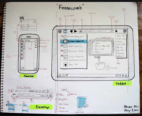
The building blocks of the Android Honeycomb design are “Fragments.” A Fragment is a self-contained layout component which can change size or layout position depending on the screen’s orientation and size. This addresses the problem of designing for multiple form factors, giving designers and developers a way to make their screen layout components elastic or stackable, depending on the screen restraints of the device that is running the app. The screen components can be stretched, stacked, collapsed or expanded as well as shown or hidden.
Using the Fragments framework, designers and developers have a couple of options for maintaining their layouts across screen sizes and orientation modes.
With a compatibility library, developers can bring fragments functionality to Android smartphones that go back as far as version 1.6, allowing them to build apps that use a one-size-fits-all strategy. It enables designers and developers to easily build just one app for everything.
While Fragments might be a term used more by developers, designers should still understand how capsules of content can be stretched, stacked, or expanded and hidden at will.
The most common arrangement of Fragments is the split view. This layout is quite common in news apps and email clients, where a list is presented in a narrow column and then a detailed view comes in a wider one.
Another way to present a split view is to turn it sideways. When doing this, the sideways list Fragment turns into a carousel, navigating horizontally instead of vertically.
ORIENTATION STRATEGIES
While Fragments are great for applying one design to a number of different screen sizes, they are also useful in setting orientation strategies. Your screen design might look great in landscape view, but when you try to put three columns in a narrow portrait view, you have a problem. With Fragments, you have the option to stretch, stack or hide content, moving pieces around and shaping or eliminating them as needed.
ANIMATION
The Honeycomb framework allows designers along with developers to use a vast number of animation effects. The Android 3.0 Highlights page says that animations can create fades or movement between states, loop an animated image or even an existing animation, change colors, and lots. Honeycomb also boasts high-performance mechanisms for presenting 2-D and 3-D graphics.
Android tablet apps are still a relatively new space, and some brands are just beginning to test the waters. Listed below are some apps you can take a look at for inspiration. Download any of them from the Android Market or Amazon.
YouTube
Naturally, Google’s YouTube app for Honeycomb is great, showcasing all of the design patterns and UI elements we’ve discussed above. Download this app first and take it for a spin to get a good feel for Honeycomb.
CNN
The CNN app makes great use of touch gestures, including flicking to view more content, the split view and even fonts.
CNBC
Another good news app that has animation and rich graphics and gradients. CNBC is one of the most visually compelling apps.
Plume
With its three-column layout, here’s a good example of how layouts might need to be changed from landscape to portrait views.
FlightTrack
A data-heavy app that is done elegantly. It includes nice maps, subtle animation and standard Honeycomb UI elements.
Pulse
Pulse for Android tablets is still fun, even though comparing the Android and iPad versions are identical in almost every way.
WeatherBug
WeatherBug was one of the first Honeycomb apps in the Android Market. It makes good use of maps and the holographic UI to show pictures from weather cams.
Kindle
Kindle stays pretty much the same as the book in using design patterns and Honeycomb UI elements. The outcome is nice and elegant, while staying true to Android’s best practices.
This concludes our 3-part series, Designing for Successful Android Tablets. Today, more than ever before, designers are being asked to create experiences for numerous varieties of different mobile website. The post-PC world of computers has brought us a myriad of different creations, the first based on our cell phone architecture, but as time inexorably marches on, and newer devices have emerged including tablets and many other categories, we can only now just begin to imagine. Android is the future.
Designing successful apps for Android tablets requires great new concepts and challenges for today and tomorrow’s best designers. With this series of articles, we hope you’ll find the KEY to making your design creations the best that it can be, better than the rest and insure your success in the future.
2 thoughts on “Designing For Successful Android Tablets (Part 3)”
Comments are closed.
















Gotta keep up the game, the use of css3 and media queries are supported by every device that matters and are mostly used. So its entirely safe to use that for responsive sites.
You shared such an interesting article for Android Designing. I really liked the article which is given in 3 part. Thanks!!!