A Beginner Guide to Mobile Responsive Design
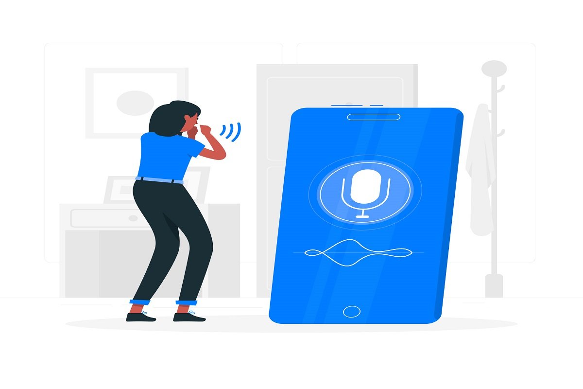
4 minutes | Word Count: 742Mobile responsive web design is about automatically delivering to your target audience what they want. It eliminates the need to have multiple versions of the website or expensive application development and maintenance as content, layout and graphics can be tailored as per the screen size.

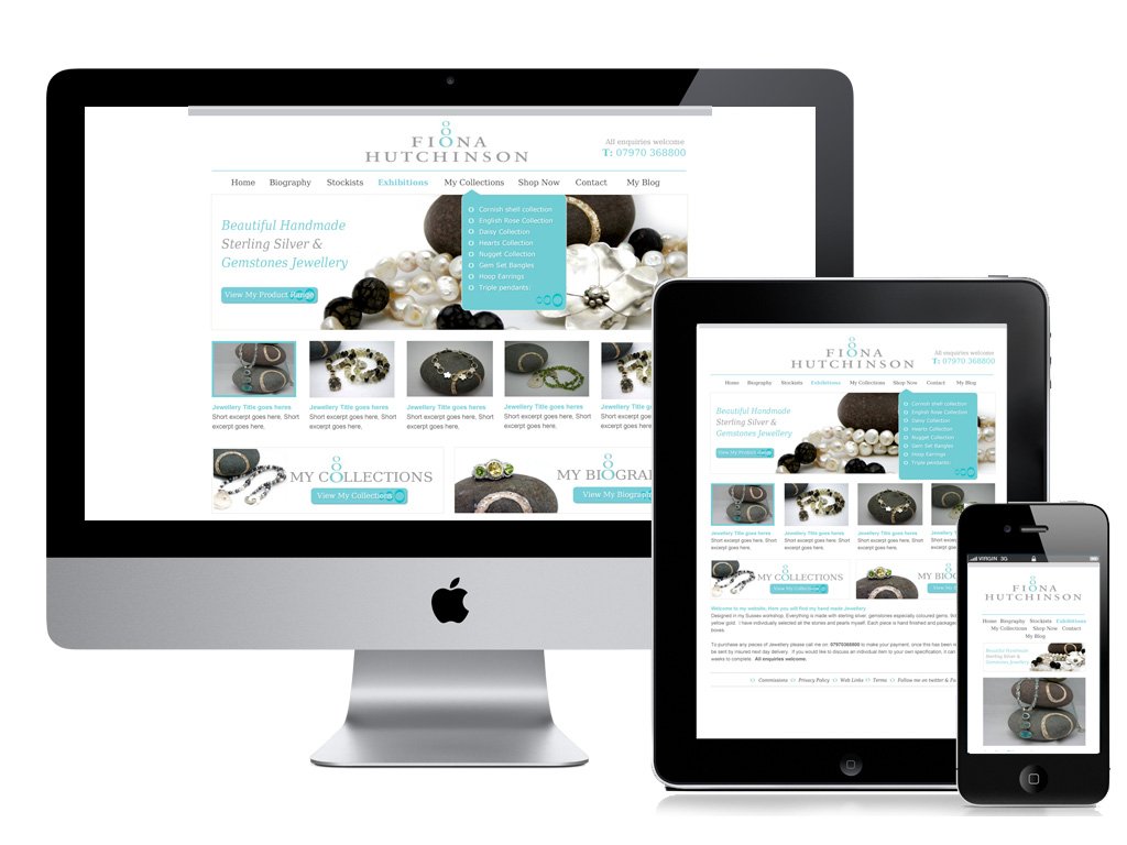
Responsive web design means that the layout and content adapts or responds on the basis of the screen size it is presented on. In general, there have been four popular screen sizes that responsive web designs have been aimed for: desktop monitor, notepad, tablet and smart phones. As the screen gets smaller, the content accordingly shifts and changes to ensure the best display for each screen.
Why responsive designs for mobile?
It is very important to care about mobile responsive designs because you want the visitors to have the best possible experience. Wondering how you can assure that your audience isn’t left scratching their heads? Here are two essential features explained by professional website development company experts:
1. Optimization of Content Layout: If someone is browsing the website from a mobile phone, undoubtedly they don’t have a bigger screen to see. Most smartphones zoom out automatically so make sure that the website is visible onscreen. This might be good as it allow readers to access the entire screen, but it is very frustrating to find information that is housed in a tiny part somewhere on the top or bottom of the screen. On mobile screens, things read a lot better when they’re stacked seamlessly, which makes for a stronger UX.
2. Adapt the visible content: It is very important to have different content presented on different screen viewing options keeping the searcher’s psychology and behavior in mind. Take, for instance, an everyday example like finding a restaurant for a night out. Studies show that when a searcher is browsing a restaurant website from a mobile device, they want crisp and clear information regarding things like working hours, location, menu or how to make the reservations. But when the searcher is browsing the restaurant website from a desktop they might be looking for more detailed information like a food blog, the restaurant’s ambiance, kind of food offered or coupons for future use. Businesses must keep search ability and audience purpose in mind when deciding on a responsive website content and layout.
How to create Mobile responsive designs?
Responsive web design is not one comprehensive technology, it actually is a collection of ideas and techniques. The two major building blocks of responsive web design are:
1. Fluid grids: A fluid grid is designed as per proportions, i.e., the layout is compressed into a small mobile device or extended on a huge screen. Accordingly all the layout elements will resize their widths according to each other. To calculate the proportions for page elements, it is important to divide the target element by the context.
- Media queries: This is the real secret to make the site responsive. It consists of media type and an expression to check for certain conditions of a media feature. ‘Width’ is the most common media feature used. By restricting the CSS rules to a particular width of the device displaying a web page, the representation of the page can be customized with varying screen resolution. The browser must meet two criteria: the media type must be a screen and minimum width of the screen has to be at least 1024px. The browser that meet both these conditions will have CSS style font-size of 100%
It is very important to think about responsiveness as much as as about the layout and content. To make full utilization of responsive design you must change your thinking and change the way you organize the content especially if you want to keep your bounce rates to a minimum. The mobile site development companies must consider questions like: how will people use their mobile device on the website, have navigation and graphics been given the same importance as the content, are there relevant options to explore and pivot and last but not the least, are content and design neat and clear? Certainly, the most important component of the entire equation is the end user.
Resource Box: Ashish Sharma works at Web-Apps as a software developer but spends his spare time to writing useful posts about professional website development. He has spent over 5 years in this Industry and still curious to adopt and learn new things quickly.