C-Swipe Can Solve Fragmented Navigation
6 minutes | Word Count: 1099If we look at recent Windows OS developments, there is one clear trend: touch devices are getting larger. The lineup already includes 12-, 15- and 21-inch touchscreens and the applications are getting more complex and full-featured every day. Google is ready to integrate touch into larger hardware for more serious computing. It’s only a matter of time before Android is forced to catch up. But scaling the current Android action bar scheme might not be realistic or ergonomically desirable for every application.
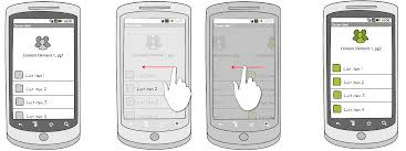
There are almost four thousand different Android devices today. Your navigation should work with every single one. C-Swipe is an alternative navigation pattern for tablets and mobile devices that’s novel, ergonomic and localized. C-Swipe can be used to bring up a contextual menu at any place on a touchscreen by simply swiping the thumb in a natural semicircular arc along the surface. The gesture is close to a shape of the letter C when it’s done with the right hand, which is why the pattern is called a C swipe.
Imagine if the entire surface of a mobile or tablet touch device was devoted to content. To navigate, the user would simply swipe the screen with their thumb in a natural semicircle gesture. They could make this gesture while holding the device comfortably and securely with both hands, while the device is lying flat on a table, while reading in bed, or anywhere they choose.

The swipe of the thumb would cause a semicircular contextual menu to display. After that, when the menu comes pops up, the most commonly used function is on top, around the final position of the thumb. The Icon and text for the menu can be positioned where they won’t be blocked by the thumb. The user then taps the item they want, and once the action is performed, the menu would disappear.
Flipboard is an elegant app that’s gained legions of loyal fans through its gorgeous UI and effective use of content as a tool for navigation. Yet, on Flipboard’s detail pages, some of the options, such as “Back,” “Favorite” and “Like”, are located in the top action
The top action bar is a recommended location for navigation and functionality in Android 4. The top bar facilitates the discovery of functions, and presents them for easy viewing at the top of the device, where they would not normally be covered by the user’s hands.
Placing the actions at the top of the screen is actually a double-edged sword. It’s difficult to reach the top bar on many devices. Even on small mobile website design, reaching the top bar requires some awkward juggling. Larger devices however, such as the popular Galaxy Note, require full use of the second hand in order to tap the buttons. This makes both multitasking and relaxed casual use more difficult.
The action bar also takes up some important space at the top of the screen. The visible functions are an effective learning aid while the user learns the app. Unfortunately, as soon as the user learns the functions, the bar visibility becomes a distraction, taking up more space.
What if there was a way to devote every part of the screen to content, while allowing the user to call up a functional menu from anywhere on the device, no matter where their hand is, and then provide direct access to all kinds of options, without any gestures and juggling. That is what C-Swipe does:
A C-Swipe gesture can be made in a couple of different but important ways: as a swipe and release, or just as a swipe only. In each case, the menu would look a little different. All you do is pick the one that is right for your app.
The user would then swipe the surface with a semicircular gesture, then release their thumb from the surface area. The release is crucial because the thumb would otherwise cover most of the menu items.
The second type is swipe only. The system recognizes the same swipe gesture, but now the menu is painted while the thumb is still pressed to the surface. Because the thumb is covering the menu options, the items must appear outside of the menu to be visible.
With swipe only, the thumb maintains contact with the device, activating the menu fastly. Which makes navigation efficient, and there is literally no wasted motion.
C-Swipe is basically a complete replacement for the current action bar menu in Android. You can use it anywhere you might currently use the action bar.
Another important point is that C-Swipe is almost always infinitely not to be confused with forward compatibility. It can be used to add lot of menu function’s than are seen on the screen, plus two or three levels of menus on the top of the existing first-level menu scheme.
There are two ways to access the C-Swipe submenu. The top row shows swipe-and-release; tapping the “favorite” function in the menu brings up a circular selection of stars. The user then has to release their thumb from the screen to see all the functions available in the submenu.
Swipe-and-hold works similarly; the user swipes and keeps their thumb on the screen. Then, when sliding their thumb to the desired function, the user would release their thumb from the screen. The main menu is then replaced with the submenu.
The C-Swipe theme has many variations, and the submenu doesn’t need to be semi-circular. This could be a longest list of text or icons or a dedicated light box, just as long as it comes up near where the main C-Swipe menu was invoked.
C-swipe has a number of important benefits. It facilitates immersive experiences and minimizes arm strain, plus it is particularly suitable for large touch devices, such as the upcoming between 15 inch to 21 inch touch tablets.
There are other Applications for C-Swipe as well. When the user tilts a large touchscreen to use it comfortably while standing, the C-Swipe navigation can be opened anyplace by making swipe with the thumb. It comes with its own “natural” animated transition, and the menu simply spins out in a smaller path, following the moving of the thumb as closely.
C-Swipe navigation has a great deal of potential. The app is a great alternative navigation concept for many of today’s devices, being novel, ergonomic and very localized. Experiment with C-Swipe and see how much your navigation can stand out above the others. It may be just the KEY to help you get ahead in today’s ever changing digital world.
2 thoughts on “C-Swipe Can Solve Fragmented Navigation”
Comments are closed.









I hate having to let go of my tablet to reach the top of the screen to navigate. I would love to see this gesture in ALL apps. It’s so easy and comfortable to do. I whole-heartedly agree.
Samsung are certainly heading that way with the Galaxy S3 and S4!