Designing For Successful Android Tablets (Part 1)
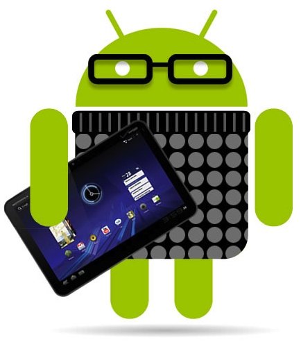
5 minutes | Word Count: 810Much more than ever, designers are asked today to create experiences for a variety of different mobile website. As tablet adoption increases and we move into the post-PC world, companies are now competing for user attention with the quality of their experience. Designing successful apps for Android tablets requires a great concept that encourages downloads, additional usage and retention. But it also requires that Android users enjoy an experience that is intuitive and native to the environment.
The following will help designers become more familiar with Android tablet app design by explaining some of the differences between the iPad iOS user interface and Android’s 3.x “Honeycomb” UI conventions.
For almost everyone, our first exposure to tablets was with the iPad. For that reason, it’s reasonable to begin by comparing the two user interfaces. Not only will this help us get up to speed, but it will become especially important when designing an Android tablet app based on an existing one made by iPad.
First, it’s not just like the iPad. While the Android tablet and iPad experience do share many similarities, like touch gestures, app launch icons, modals, etc., designers need to be aware of the many differences before making assumptions and drawing up screens.
SCREEN SIZE AND ORIENTATION
The biggest difference between the platforms is the form factor. Layouts for the [p2p type=”slug” value=”great-ipad-tips-and-advice-for-new-users”]iPad[/p2p] are measured at 768 × 1024 pixels, and the iPad uses portrait mode for its default viewing orientation. With Android tablets, it’s more complicated, due to the multiple device makers. In general though, there are 7- and 10-inch Android tablet screen sizes, and a few in between.
What this means in pixels is that you should consider a good baseline for your layout is 1280 × 752 pixels, based on a 10-inch screen size and using landscape as the default orientation. Content on Android tablets, like the iPads, can be viewed in either landscape or portrait view, but landscape mode is usually preferred.
However, with Android, screen size is only part of the equation. [p2p type=”slug” value=”important-things-android-developer-consider-android-apps-development”]Android[/p2p] tablets also come in different “screen densities,” or the number of pixels inside a given area of the screen. Designers have to prepare all production-ready bitmaps by scaling each bitmap to 1.5×and 2× of its original size. So, a bitmap set to 100 × 100 pixels, for example, would also have copies at 150 × 150 and 200 × 200. Making three batches of graphics scaled at these sizes, lets you deliver your bitmaps to medium, high and extra-high density tablet screens and not lose image quality.
SYSTEM BAR
While Apple’s iOS makes minimal use of the system bar, Android’s Honeycomb expands its size to include notifications and soft navigation buttons. There is a “Back” button, along with a home button as well as a “Recent apps” button.
Android Honeycomb’s system bar and buttons are always present, and they appear at the bottom of the screen no matter which app is open. The only exception is a “Lights out” mode, which dims the system bar in order to show immersive content, like video and games.
BACK BUTTON
While the bulkiness and permanence of the Honeycomb system bar might seem an obstacle to designers, it does free up the real estate that is typically taken by the “Back” button in iPad apps. The “Back” button in Honeycomb’s system bar works globally across all apps.
ACTION BAR
Most of the UI differences between platforms is found in the way the top action bar is done. Android suggests a specific arrangement of elements and a very specific visual format for the action bar, including the placement of the icon or logo, the navigation, or drop-down menu or tabs, and common actions. This is one of the most unifying design patterns across all the Android Honeycomb apps. Familiarizing yourself with it before attempting to customize it to be similar to an iPad might be worthwhile.
WIDGETS
New to iPad users will be Android’s customizable widgets. As the name implies, these are tiny notification and shortcuts tools that the user can set to appear on their launch screen. Widgets can be designed to show several things including stack views, grid views and list views, and starting with Android 3.1, they are all now resizable.
NOTIFICATIONS
While iOS’ notifications system pushes simple alerts onto your launch screen, Android’s Honeycomb offers rich notifications that pop up, like “toast” as we used to call them, in the bottom-right part of the screen, similar to Growl on Mac OS X. Custom layouts for these notifications can be anything from icons, ticker text, or even actionable buttons.
This concludes Part 1 of our 3-part series, Designing for Successful Android Tablets. In Part 2, we will continue our discussion on Android design with Settings, UI elements and Fonts as well as several other categories of interest.

