Make Your Site Irresistible: Hottest Graphic Design Trends Nowadays
6 minutes | Word Count: 1116The world of graphic design is vibrant, dynamic and ever-changing. Sometimes, trends emerge and disappear in a blink of an eye. At the first glance, it may seem difficult to ensure that your website catches up with the latest tendencies, but in truth, the trend evolution is not as unpredictable as you might think.

This is due to the fact that trends in web-oriented graphic design are set not only by coincidental and unforeseen artistic aspirations of the designers. Actually, the most dominant tendencies are driven by technological development and the always-growing need to improve user experience. That’s why it’s quite possible to predict most of the tricks web designers will use in the forthcoming period to make their websites both easy to use and aesthetically appealing. Here’s a quick overview of the several most important trends that are here to stay.
Mobile-friendly design
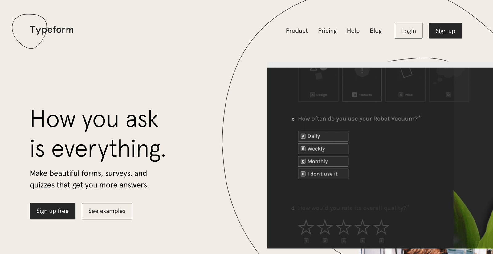
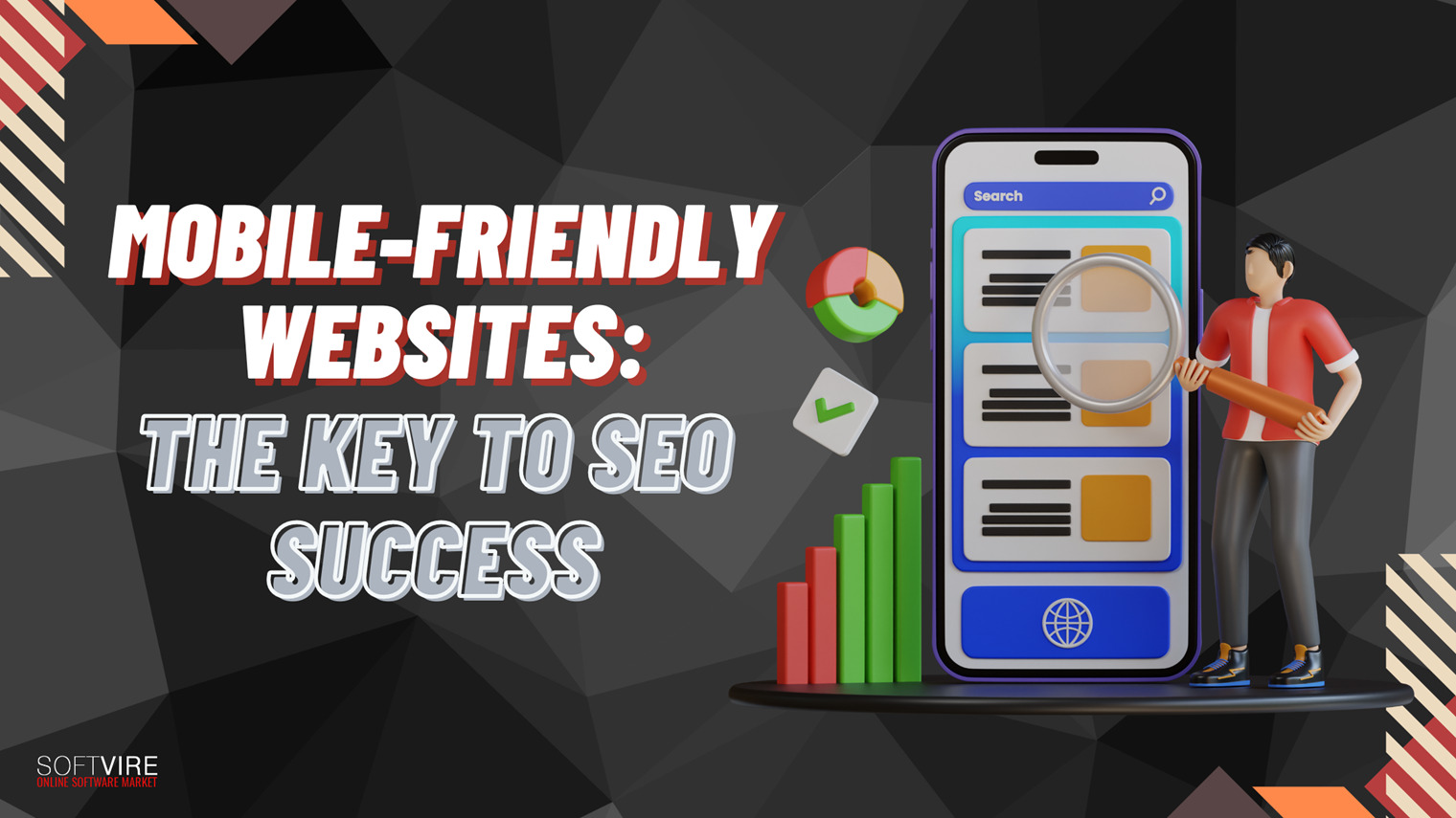
In 2016, we’ve seen mobile browsing finally exceeding that of desktop computers. In addition, Google has recently announced that they’re starting to apply mobile-first indexing. All this hasn’t caught designers off-guard, and they are trying to make websites as mobile-friendly as possible.
They’re coming up with new ways to organize and highlight the most important pieces of information. The need to use space in an economical and functional way has become a part of their routine and you should follow the same path, too. Typeform is a nice example of how you can use a clever simplification of your desktop website to create a great mobile-friendly design.
Bold and custom-made fonts
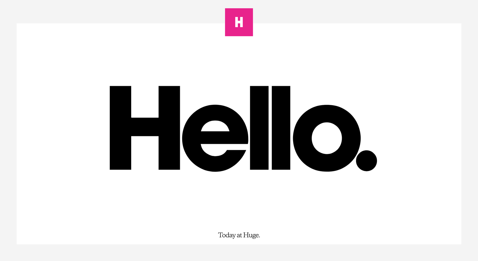
As for the evolution of typographical elements, there’s two obvious trends emerging. First of all, the years of subtlety seem to have passed when it comes to typography. The development of all sorts of devices has enabled designers to use tailor-made fonts in order to create a distinct and unique experience. They no longer have to fear that these will look ridiculous and grotesque on some low-resolution gadgets.
Furthermore, making use of big bold fonts is also a good idea. They are becoming more and more popular, as brands want to add emphasis, attract attention and distinguish themselves from competition using all available means. Take Huge, for instance, a company that brilliantly used the symbolism of its name and turned it into a clever design trick.
Intense colors
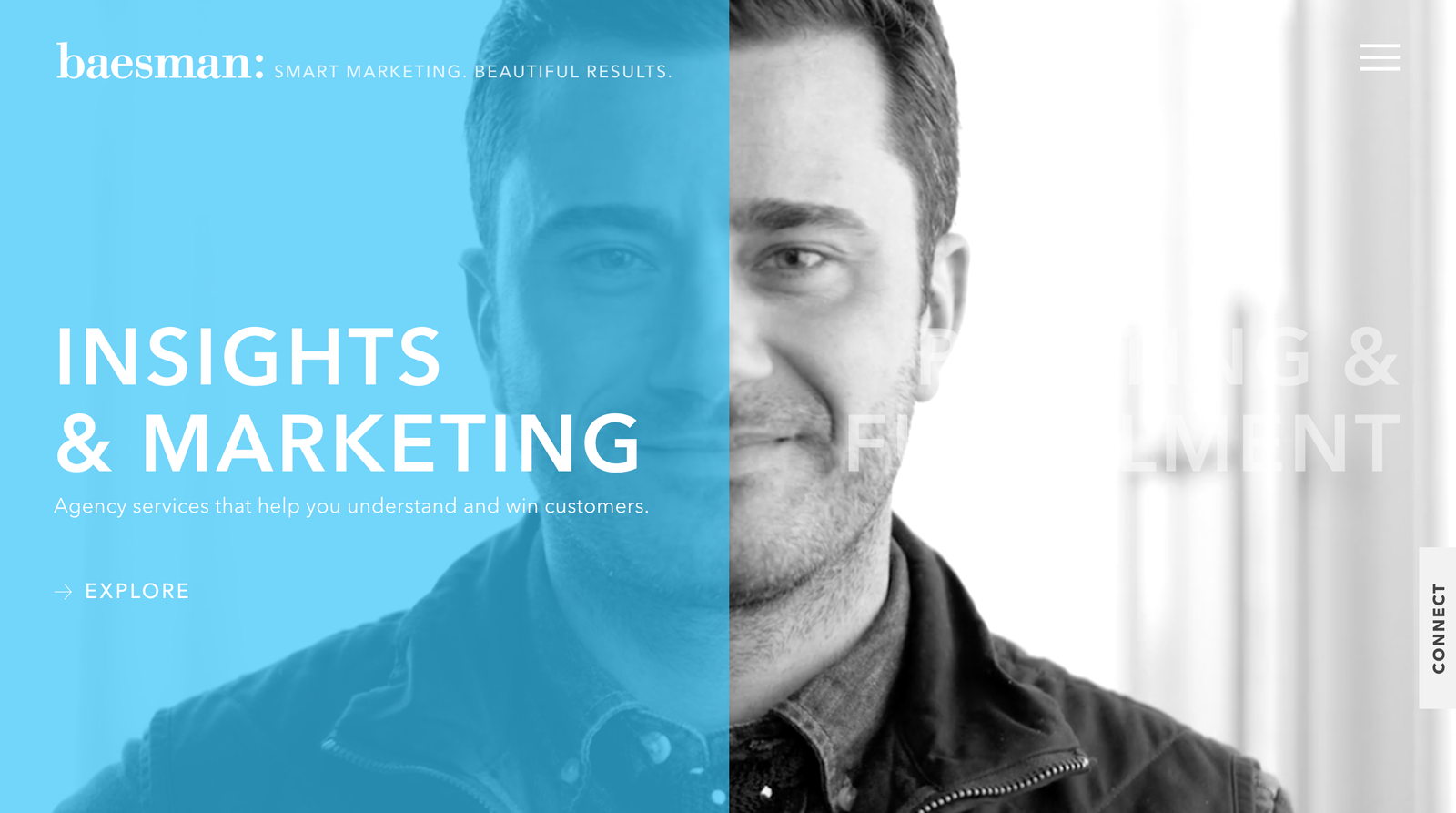
The colors you choose for your website, your logo and your brand in general depend on a number of psychological factors. However, recently, adventurous and vibrant colors have become dominant. You can take a look at Baesman’s homepage as a perfect example. New brands are using these lively colors to draw attention the simplest possible way.
At the same time, some brands perceived as traditional or even boring employ these colors in order to reestablish themselves as unconventional and hip. Some of these designs do look like a desperate attempt to get just a second of the potential customer’s attention and present a certain company in a way nobody actually perceives it. Hence, when it comes to unconventionally bright colors, there’s a serious threat of overdoing it. In order to avoid this, be careful when employing this strategy on your website, or at least think about consulting some of the top graphic design companies about how to do it right.
Gradients

There’s another growing color-related trend in graphic design, and this one seemed to have died out some 10 years ago. However, now it’s back. The use of gradients started losing its appeal at the same time when flat design started gaining popularity. Namely, gradients add depth to your design, while going flat meant employing as little elements that give out the feeling of third dimension as possible, mostly to ensure a more efficient interface design.
The trend seems to have returned when Instagram changed their logo into a colorful gradient back in 2016. Since then, flat design seems to have evolved in a way that can handle the elements that are adding some depth to it, and a hybrid semi-flat design was born. In addition, the transition between different colors is smoother than it used to be and therefore it’s easier to reconcile gradients with the flat approach. A big advantage of gradients is that they help designers and users determine the hierarchy of the page. Finally, using them can help you create a more realistic look, as the world is mostly not made out of flat colors.
Illustrations
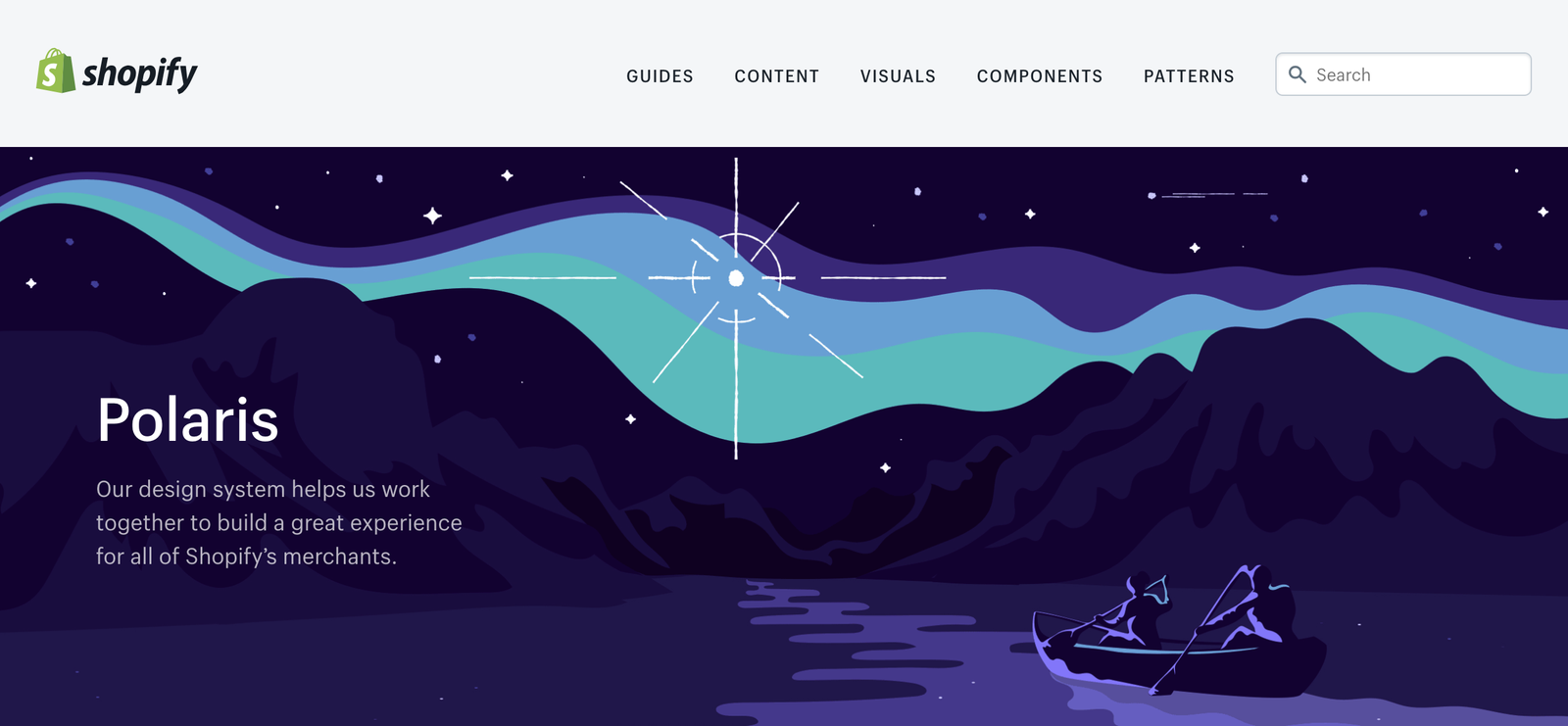
Custom illustrations add a bit of a human touch to your website and make it more fun and entertaining. They make the experience less impersonal in a number of ways. As it was nicely put by one of the authors of the Webflow magazine, using a photo of a human makes that particular man or a woman a personification of the user, but leaves everyone else out, including the actual user. Shopify offered a great example of how to use an illustration of a human being in such a clever way that any one of your users can relate to it. This method will be heavily used by designers in the forthcoming period.
Integrated animations
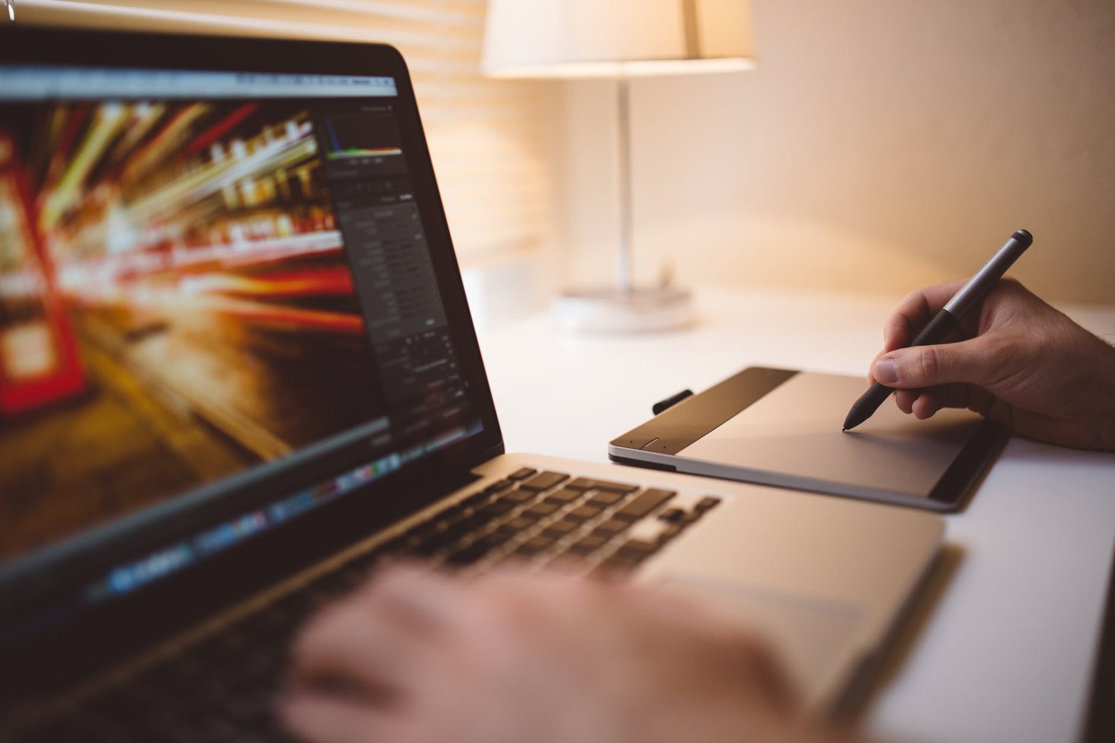
As we’ve found out with the recent discovery of the power of videos in digital marketing, it’s much easier to engage people by using moving images than by using basically any other media. That’s why animations are so useful. They allow us to convey a lot of information using minimal resources, but at the same time they’re dynamic and fun to look at. Browser technology has finally developed enough so that developers and designers can use them safely, without a risk that they will make the website slow and unresponsive. Check Inturn’s website to get a glimpse of how to do this the right way.
Conclusion
All in all, a lot of trends that have been dominant lately confirm that there won’t be much room for subtlety and elegance in graphic design any time soon. Designers will have to conform to the general tendencies of our culture, and website owners will have to follow suit. Shorter attention spans will cause websites to be fast, dynamic, colorful and entertaining. Most probably, this will remain true for the years to come as well.


